
https://jkphl.is/@jkphljkphlJoschi_Kuphaljoschi.kuphalJoschiKuphaljoschi@kuphal.netArticles RSS feed
squeezr
Another take on device-aware adaptive images and server side CSS3 media queries
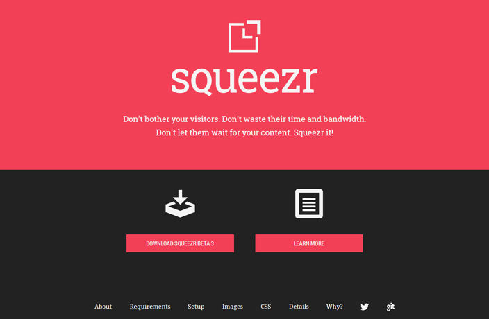
squeezr is a free PHP library for server side image and CSS manipulation. It aims to match the dimensions of images to the client device’s limits and / or strips out CSS parts that would never apply to the client device. It can help you preserve your visitor's bandwidth and thus improve the overall browsing experience across the different devices.
The project website features a test pilot to put your site under scrutiny
squeezr is a little project that I started after we had used Matt Wilcox’ Adaptive Images (AI) in a couple of projects. Although we loved working with AI, I had found some drawbacks that I wanted to overcome, so I started an at least partly fresh approach.
The squeezr source code can be downloaded at GitHub for free. The project website at http://squeezr.it features a lot of in-depth details as well as a test pilot that you can use to check the effects that squeezr could achieve for your site.
The image engine
Image adaption in squeezr is based on the following sequence of stages:
- A very tiny JavaScript in the
<head>section of a website measures the client device’s capabilities and stores them in a cookie. - Along with each image request, the cookie is sent to the server. The server reads the cookie values and determines the optimal image dimensions for the client.
- If an appropriately downscaled version of the image has been delivered before (to whichever client), it has been cached, so the server can just deliver it right away out of the cache on any further request. As opposed to Adaptive Images, no PHP is involved so far.
- If a matching image has not been processed before, squeezr will appropriately downscale and deliver the requested image. At the moment, squeezr supports GIF, JPEG and PNG images (both 8- and 24-bit).
The CSS engine
When I first learnt about the fact that a CSS3 media query given as inline media attribute like in
<link type="text/css" href="..." media="screen and (min-device-width: 80em)"/> doesn't prevent a device from downloading the CSS file — even if it would never satisfy the media query due to hardware limitations — I was really, really disappointed. To a certain extent, this leads the Mobile First approach and progressive enhancement as a principle ad absurdum. Why should the weakest device, having the least capabilities, need to download the full set of CSS, just to discover that significant parts of it will never apply?
With some of the recent approaches for responsive images in mind I was willing to find a solution for this drawback. In fact, this is the innermost reason for me to come up with squeezr, and having it also deal with images was more a thing of completeness than of ingenuity. squeezr's CSS engine operates very similar to it's image engine:
- Having the information about the client device’s capabilities, the server parses and analyses each requested CSS file prior to delivering it.
- The file gets split into media-query and non-media-query sections. Only the sections applying to the device (as based on it’s display capabilities) get copied over into the response CSS.
- squeezr optionally applies minification on the resulting CSS to further save some bandwidth.
- As with images, also the CSS results get cached and delivered from cache on any further request.
Future improvements
Unfortunately, I don’t find the time to further improve squeezr at the moment. I do have some ideas though:
- I am in contact with ScientiaMobile, as server side device detection via WURFL could be another valuable component for squeezr.
- The image engine could support more image formats, like for example WebP.
- The image engine could support more post-processing tools. At the moment, only pngquant and pngnq are supported.
- The image engine could support what I call “uber-sampling” for JPEG images. Daan Jobsis described this technique in an article.
- I have a certain idea for supporting a kind of Art direction use case with the help of squeezr. However, it’s too early to talk about this right now ...